PROPOSAL
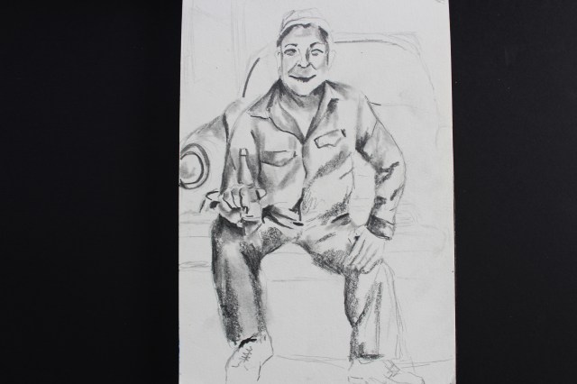
“For me, painting is the sad and dark point of life. In it I try to express the deepest of the human being. While the upholstery is the happy part of life.”
Violeta Parra.
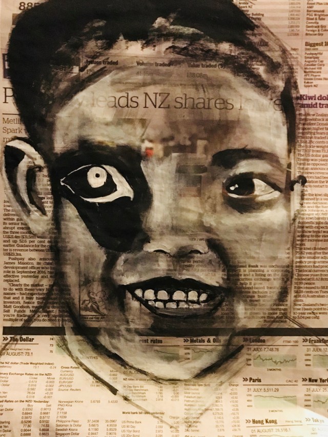
Faces reveal expression impossible to hide, our eyes are mirrors of the soul, they are silent voice which wants to escape and I make dormant in my drawing . the observer uncovers your own hidden reality, at a glance, quiet and full of emotions that invites us to be aware that we share a common, destiny. those headaches are also ours, and that many times we can witness the death with the eyes open.
-. Development and objectives this week:
This week I followed with some sketches trying to resolve the shape of the distortion of the faces, specifically in the eyes because they have a great influence on the face emotions, began giving oval shapes of black and white tones. Both in the shape of the eye and in the iris trying to give contrast between black and white, to form an image of desolation, but the last sketch formed only a spot on the eye and the shape of the iris produced it with a thin line circular I think it produces more depth. This reminded me of Pablo Picasso in his distortion images,( but at the same time different by using more geometric tonalities and images in the faces that the artist used and I think I focused only on black and white and only place spots and not have a certain structure) https://www.christies.com/zmags?ZmagsPublishID=21f639e7
https://www.christies.com/features/Pablo-Picasso-A-thirst-for-innovation-7739-1.aspx
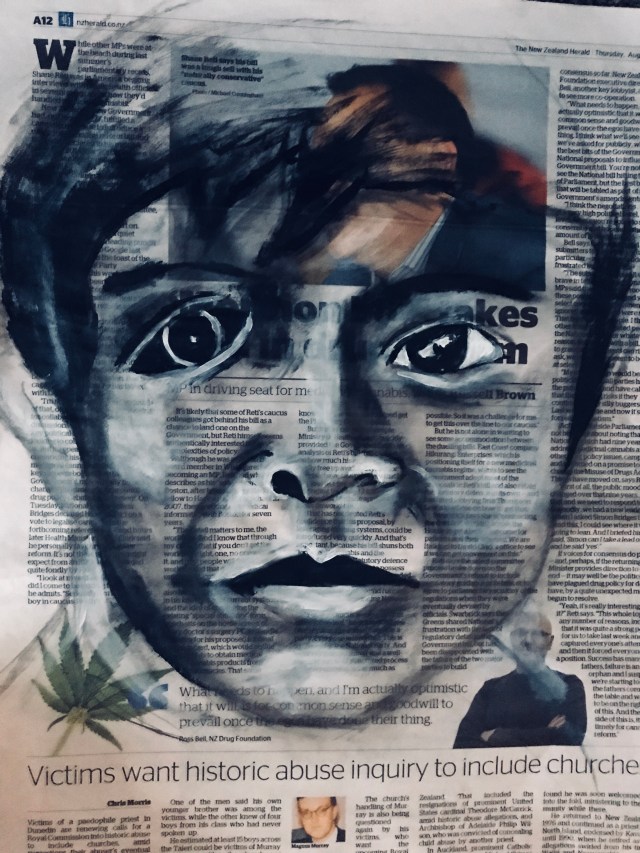
I will continue with the distortion in the nose and mouth but with spots and some basic details with a contrast colour to produce the impression of the mouth and nose. These changes will only be used in the middle of the face to continue in line with what the picture (poses and on the other hand the story behind each image.)

 this week I’m thinking about working on the location of the faces and tones that I will use for these faces and start designing if I can place in a linear way, it seems a good idea to put them in line lines as seen in these portraits and cover your face with other type of material as it is an easy paper to break, for that I have been investigating some Latin American artists and I found interesting as Marco Antonio Jimenez Iriarte, who uses their faces with a background very different from the tonalities of the face, the only diferent it is the use of the material that is paper and in my case it is interlining. The first thing is that I must resolve are the tonalities and backgrounds of the faces rand I think I will put them in group form. Research https://goo.gl/images/Bs8CFH
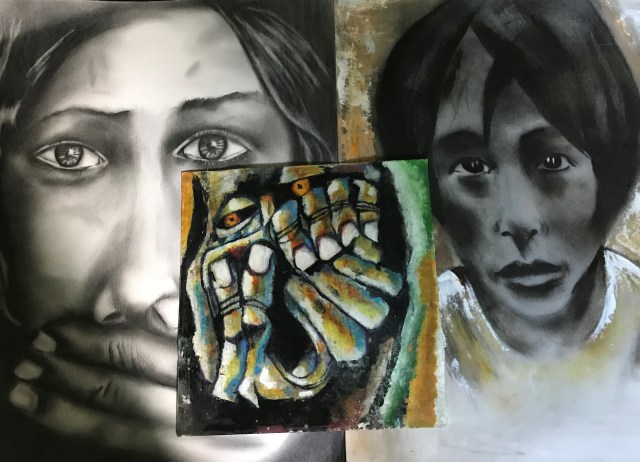
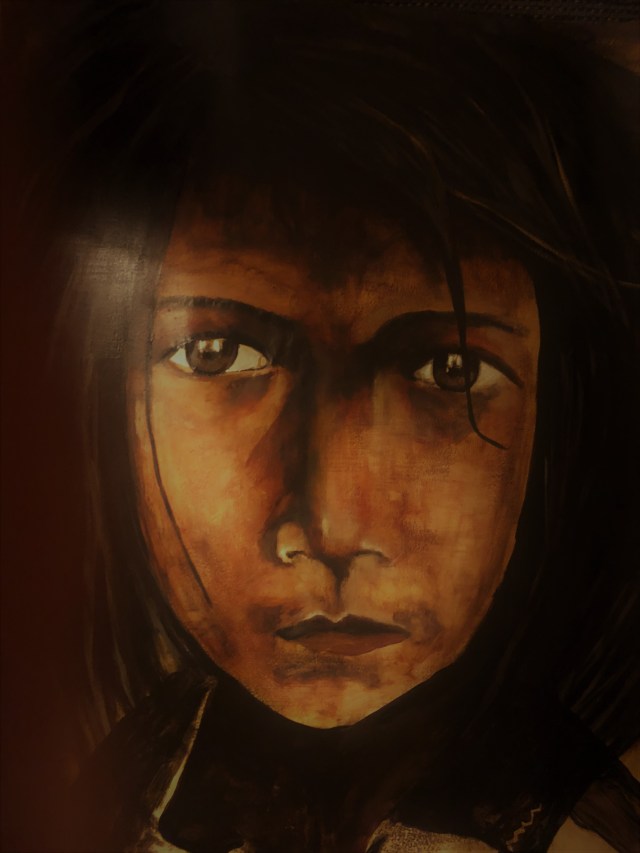


 A2, acrylyc background, Black Chalk, pencil B6